The object I chose to examine isn’t the most eye-catching. It isn’t brightly colored or gilded in gold, and it doesn’t look particularly delicate or specifically difficult to construct. I knew I wanted to pick something out of the Color Across Asia exhibit, and I’d expected to pick one of the more ostentatious pieces. There were plenty of teacups and matching saucers to pick from. As I was looking around, though, I picked this one because there was an aspect of it that stood out to me. The first thing I noticed about this piece that the Ackland described as a “covered box” was how its base and lid didn’t seem to match to me. Yes, they’re the right shape and size to fit together, but it’s the difference in color that I noticed.
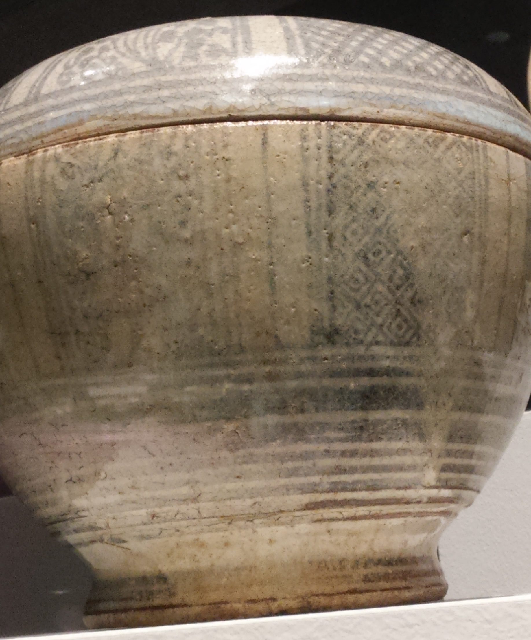
Both pieces are gray/white clay with black/blue paint decorations; however, the base is noticeably darker than the lid and its decoration more faded. My first assumption was that the base was kept out on display or in use holding something while the lid was kept in storage, not exposing it to the sun that might cause these discolorations.
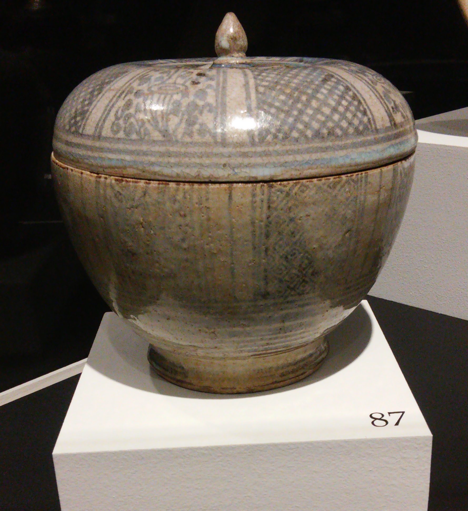 Figure 1
On a closer inspection still, decorations between the lid and base simply don’t seem to fit together. The vertical lines present on both the base and lid don’t match up, for one. With the above image, Figure 1, even if a few of those lines were to line up, none of the rest would. In fact the base’s vertical lines seemed to be arranged in two wide bands, bordered from the rest of the design by narrower bands. The lid’s pattern repeats only one wide band flanked by two narrower ones. And between each set of bands is either a section of what I’m going to refer to as floral elements or a section of crossed grid lines.
 Figures 2(left) and 3(right)
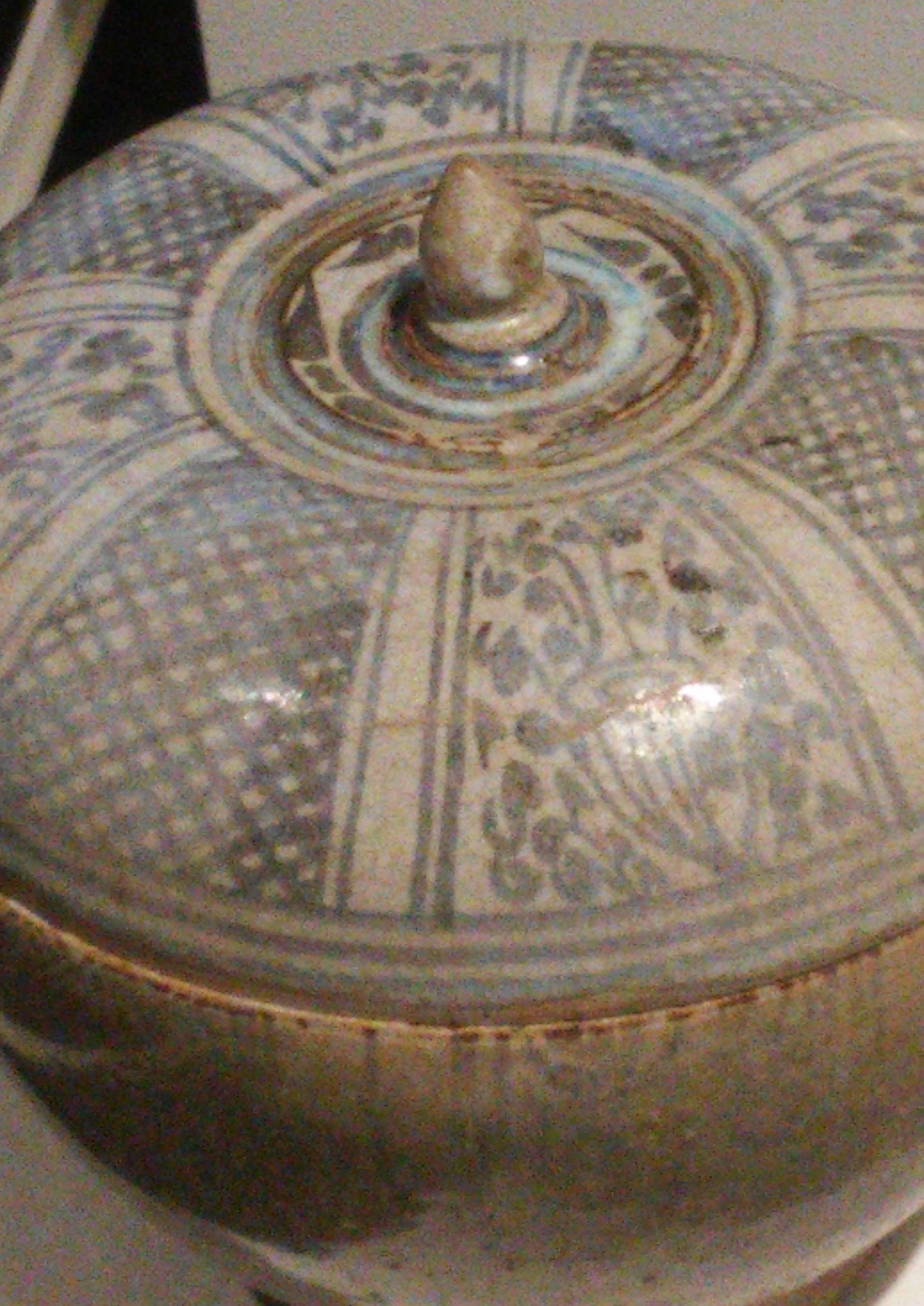
Figure 2 above shows clearly the repetition of the pattern: bands, floral, bands, grid, a pattern echoed on the base but differently. It’s difficult to distinguish the floral patterns between the lid and base since the base is so faded, and the display was kept in the corner of the room, so I couldn’t walk around it. The grid pattern, however, is clearly dissimilar. The lid’s grid pattern are simply crossed lines while the base’s grid pattern are concentric squares. It’s worth noting that the entire “covered box” appears to be hand-painted, hence why some of the grid and bands lines aren’t as straight or even as they would have been via machine.
No doubt both pieces have been weathered though very unequally, and this compared with the disparity in design cohesion leads me to suspect that, while they may have been made by the same Thai potter (and I say Thai because I read the informational panel on the wall, Figure 4 below), it doesn’t seem to me like they were meant to be together. I can’t verify that they were even made by the same potter except to suspect that there were a lot of these “boxes” made commercially, and the potter was used to making them all the same size and shape. After all, the pieces do appear to fit remarkably well. To that extent, they must have been displayed together to show their intention and pieces of a whole rather than whole pieces themselves.
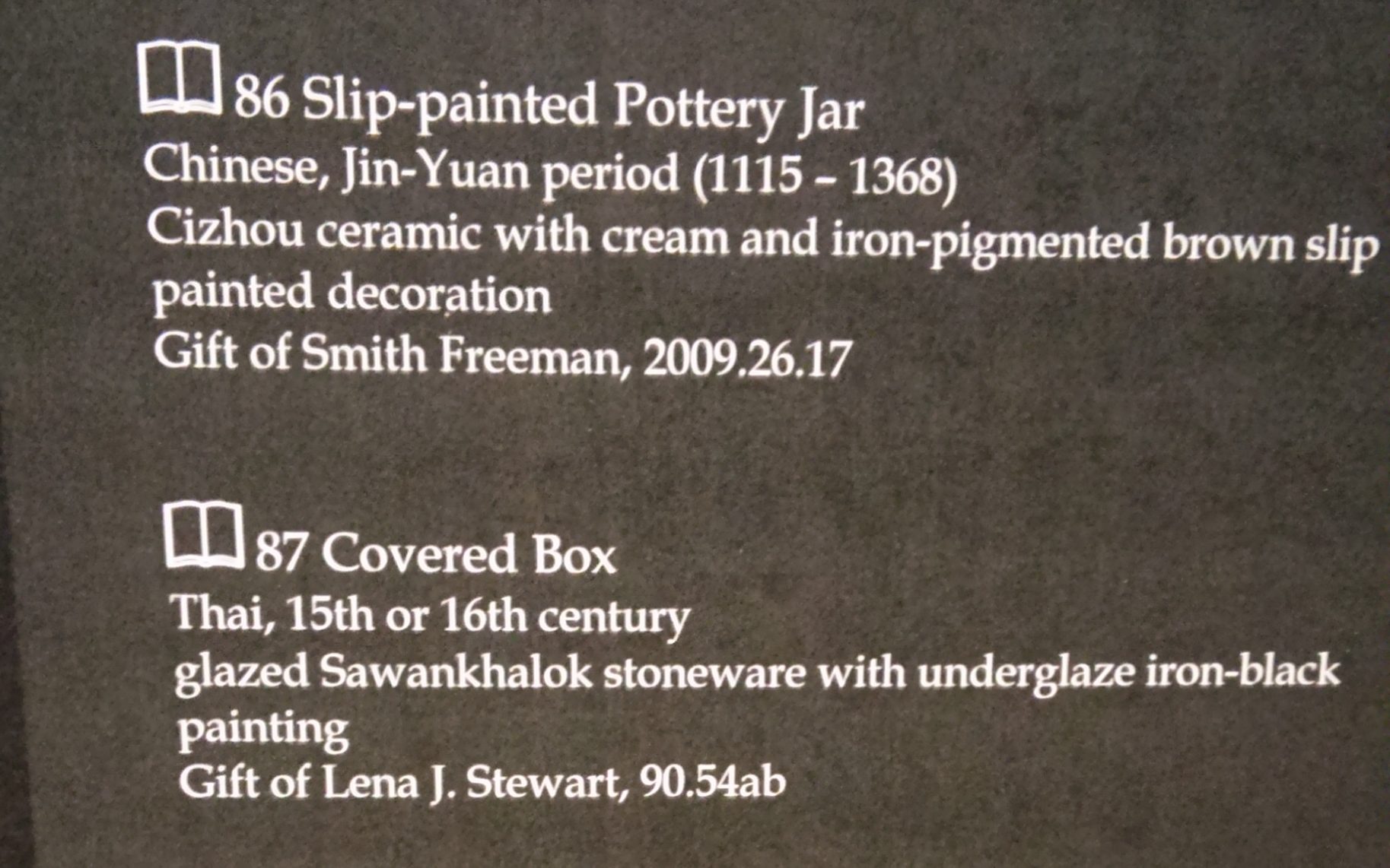 Figure 4