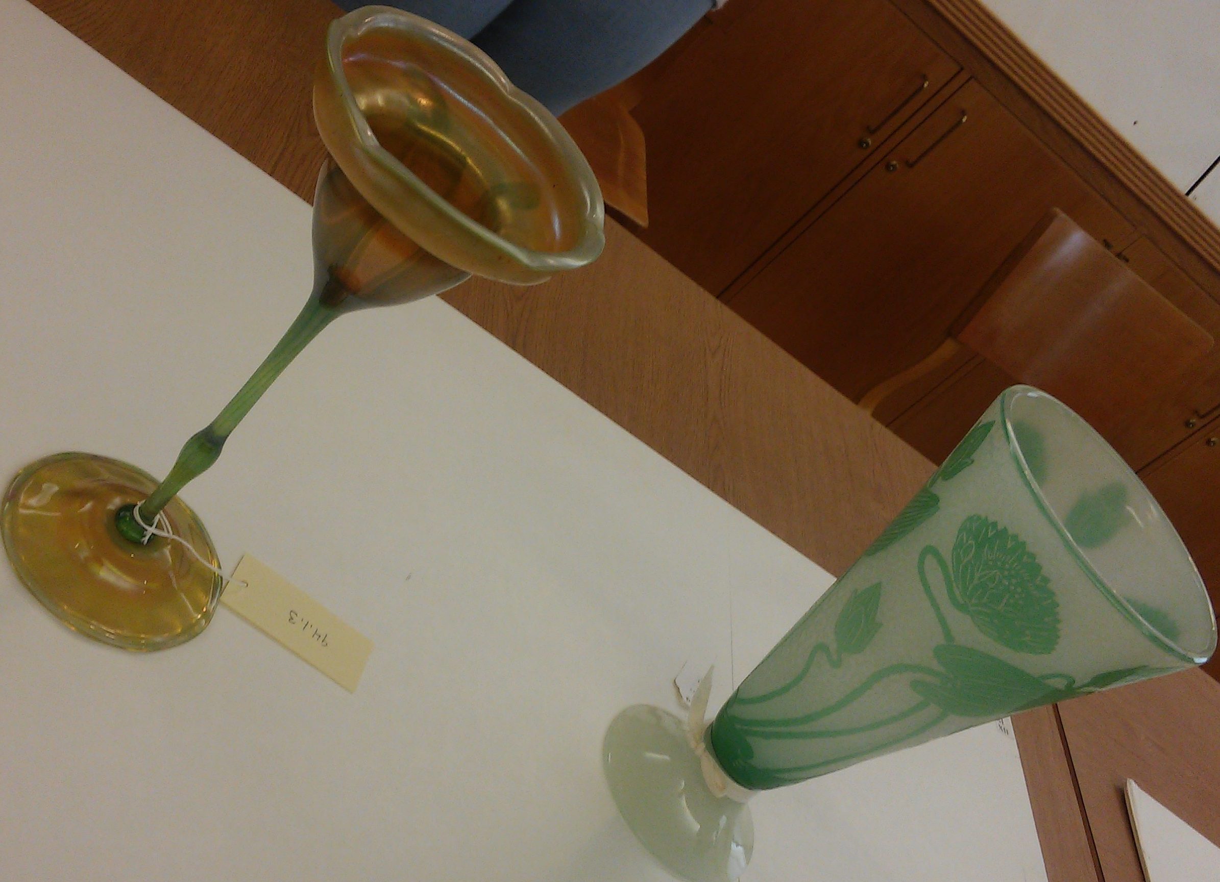
(I apologize for the weird camera angle. I wanted to maintain some closeness to the pieces yet still get them both to fit in the picture.)
The glass pieces I chose to observe were a couple of the ones shown in class March 20th, the floral glasses. Immediately I was drawn to them for their colors and natural, floral properties. It is clear that these pieces are joined by that similar theme and that they are both glasses (which is to say that they are both glass cups and containers).
To examine them a bit more closely, what I see is one long-stemmed glass with a two-leveled cup at the top and one wide-mouthed glass that evenly tapers in toward its base, both of roughly equal height.
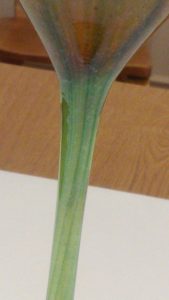
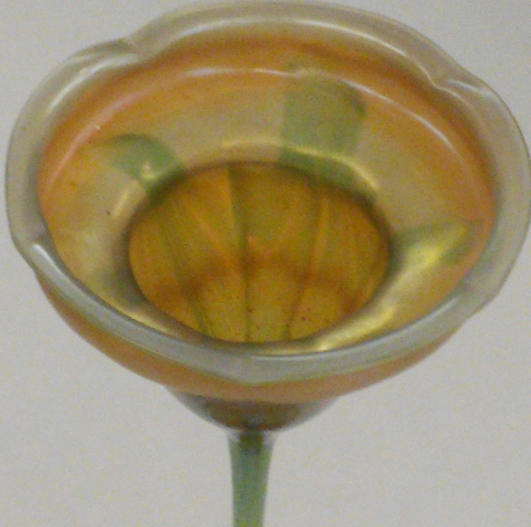
The glass on the left more closely resembles a flower itself, starting not necessarily at the base but where the base joins the glass’s stem. Up along the stem toward the flowering portion, fine, green lines have been added vertically, echoing the semi-translucent surface details of actual plants with long stems. I suspect the section of the stem that bulges (visible in the far left image below) is another imitation of an actual plant, somewhere a leaf might grow from (or was plucked from), rather than being there for practical purposes. It’s not high enough on the stem to be somewhere to hold it by, and I can think of no other purpose for it. The bulbed base of the flower’s head also trails these green lines, though they’re more obvious on the orange base that extends up into the lip of the glass where definition for the petals are given. For ease of creation, the flower head does not distinguish between its petals anywhere except on the pale lip of the glass where it dips in five places, clearly intended to be perceived as petals. Could the artist have made more distinct petals throughout the flower head? I’m sure he could have, but maybe it would have lost some of its function as a container. Though it seems that petals distinctions are a bit more obvious in the base where the glass waves along its circumference to imply distinct petals. And I say “petals” rather than “earth” because the color directly matches the flower’s head. Why there would be petals at the base may merely be artistic license to continue the floral motif, but a glass does need a base to stand. I’m betting this piece was made in three pieces: the base, stem, and head. They seem like natural places to separate the glass pieces, and if the glass it hot enough and the artist skilled enough, easily joined and blended to appear seamless. It’s easier to imagine a joint in the base rather than the neck considering the obvious color contrast present in one place and not the other. I couldn’t say how it was painted, not knowing much about how to get a variety of colors into glass, but I can theorize that the base colors of orange or green were present along first before the extra details were mixed in. The perceived paleness of the lip was likely intentional to draw attention to the dips that would distinguish the flower’s petals.
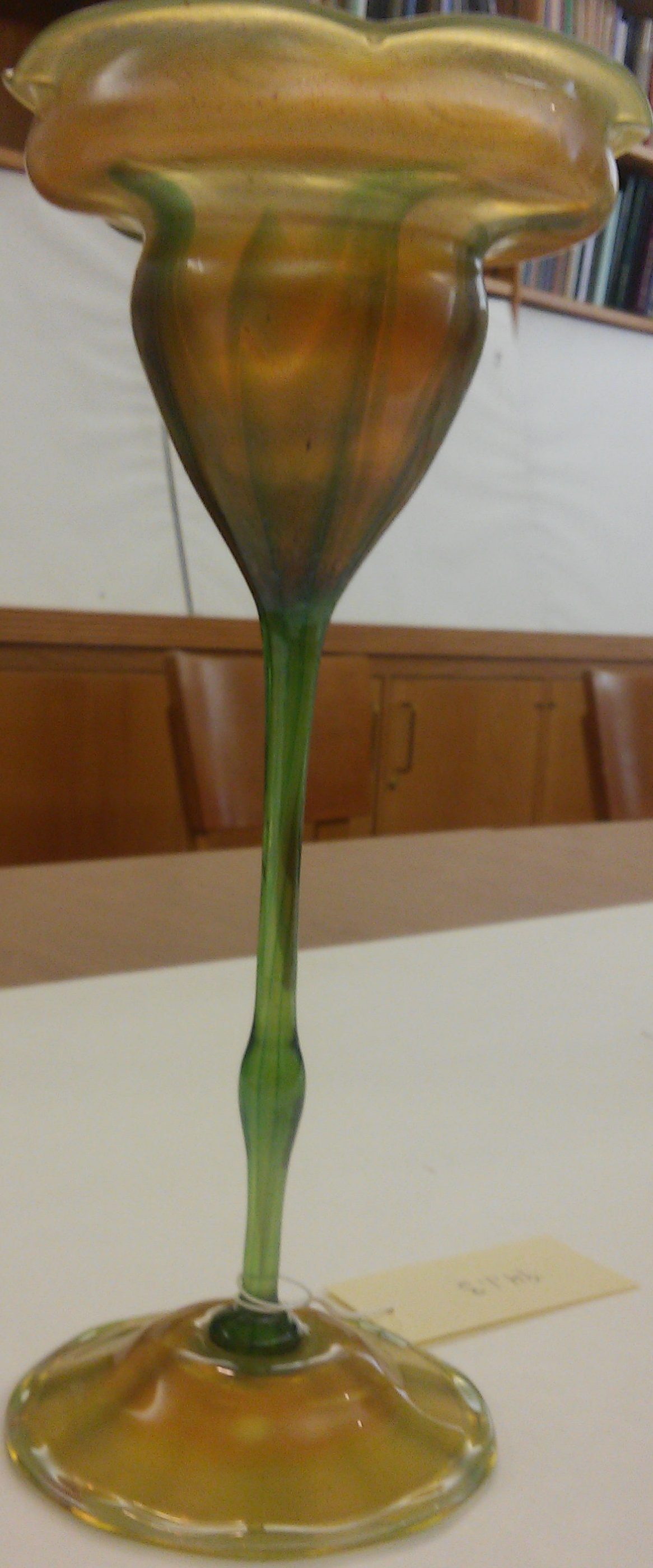
Why the artist made this piece may just be for decorative purposes given its delicacy and colorful appearance. However, given that it was mentioned in class that the piece is from the early 1900s where plastic wasn’t yet commercialized as a more durable alternative to use in drinking glasses, it’s very likely that this was sipped from for special occasions. “Sipped” because from peering inside, it doesn’t seem like it would really hold a lot of liquid, and the curve of the lip would make it somewhat difficult not to spill. Drinking just seems like a very unlikely intended purpose.
Rather than embodying its floral nature like the glass on the left, the glass on the right more showcases its nature designs. Rather than being in the shape of a flower or natural object, it’s shaped like an inverted cone with its tip converted into a base for stability. A majority of the glass is white and barely translucent with green nature designs on the outside. Though they are visible on the inside, they’re of clearer definition on the outside, implying maybe that it’s meant to be viewed from the outside or that something is supposed to be placed in it. It definitely appears to be much sturdier (also heavier) than its partnered object and has a relatively thick wall. It doesn’t have bright, party-like colors like the left piece, but it does evoke images of relaxation or, as someone in class noted, something beach-y. In a sort of fun, relaxed atmosphere, I think both these objects would be at home.
An interesting question for this piece would be of its construction. It seems clear that there were at least two pieces fused together to make this one; you can barely see the seam between the mouth and base under the white ribbon in the left image below. The trouble comes with trying to figure out how the top was made. The surface of the outside is too smooth in appearance (as we weren’t allowed to touch anything) for the green to simply be painted onto the outside of the piece. Except if there was such thing as a glass sealer than also had the appearance and consistency of glass, but I don’t know if you can layer glass like that. And whatever technique it was that applied the green flowers and leaves to the side also added a green ring on the outer edge of the rim, likely to bring attention to where the opening of the piece was for definition purposes since the base is all a translucent white. The base also appears to be shinier than the cup like the cup was frosted where the base was polished. It looks similar to porcelain with its color and polish. Someone in class mentioned Art Deco with this piece, and I want to agree simply for the time period, but I don’t know enough about that period aesthetically to say the thought was genuinely mine.
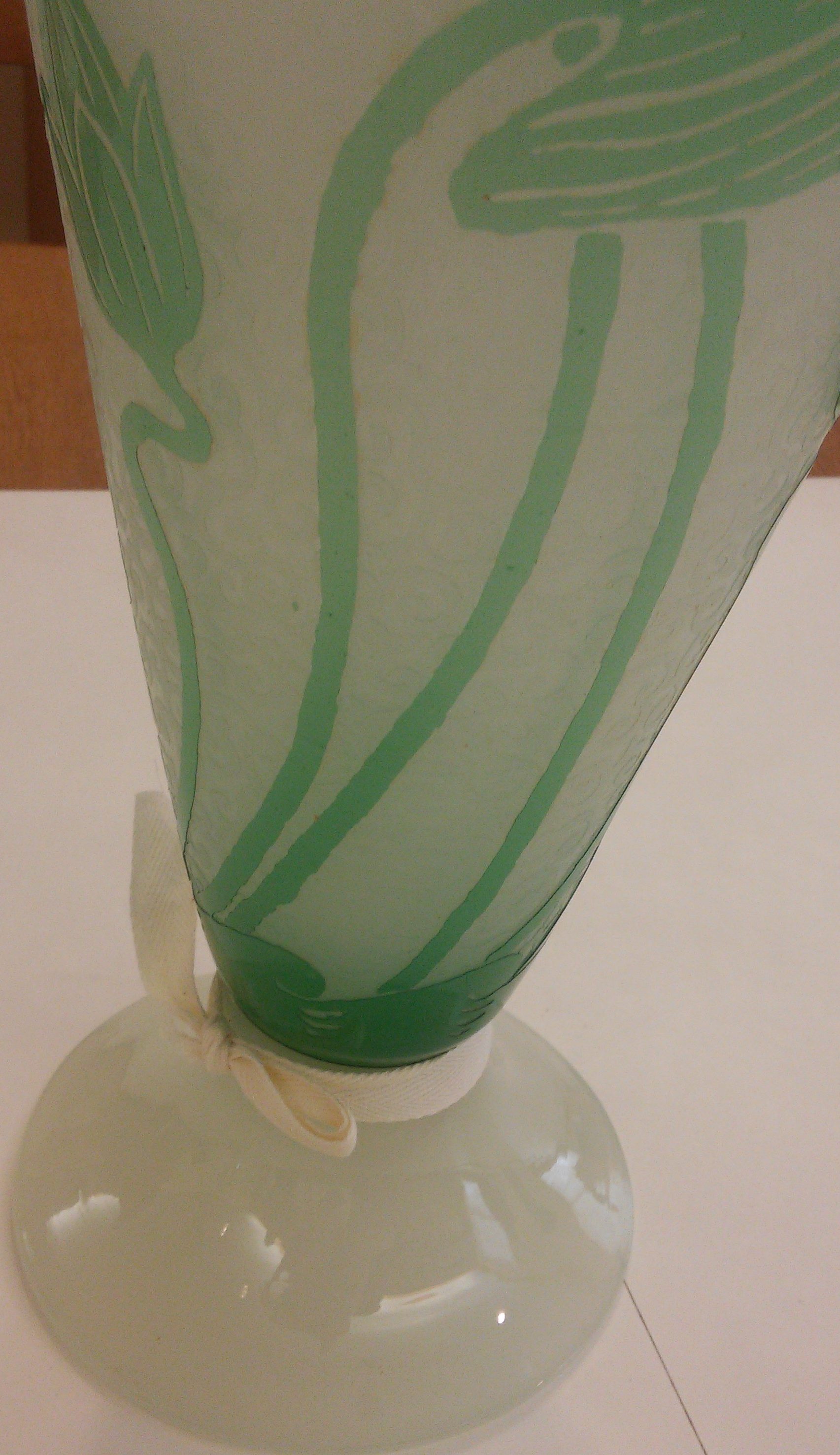
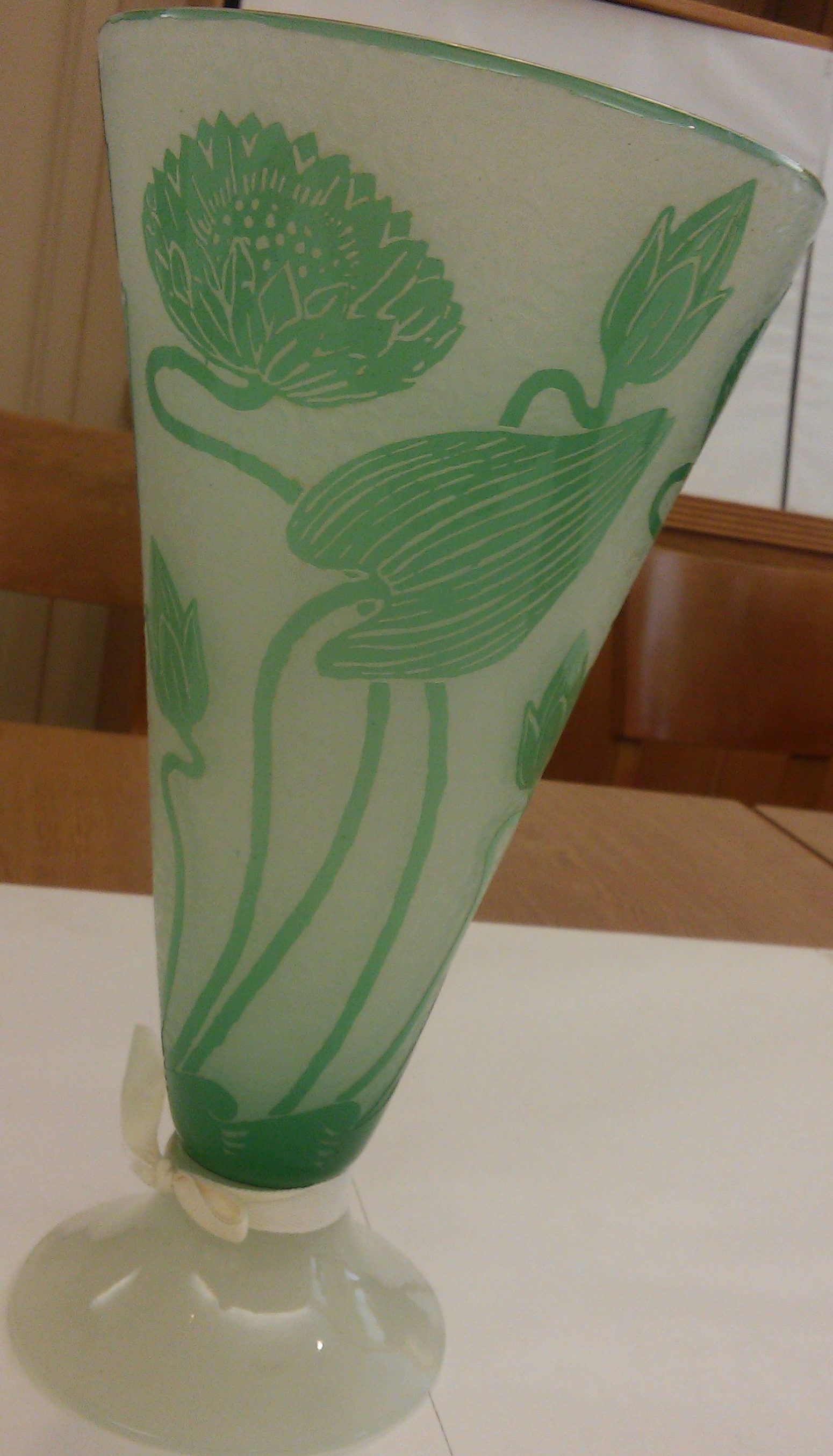
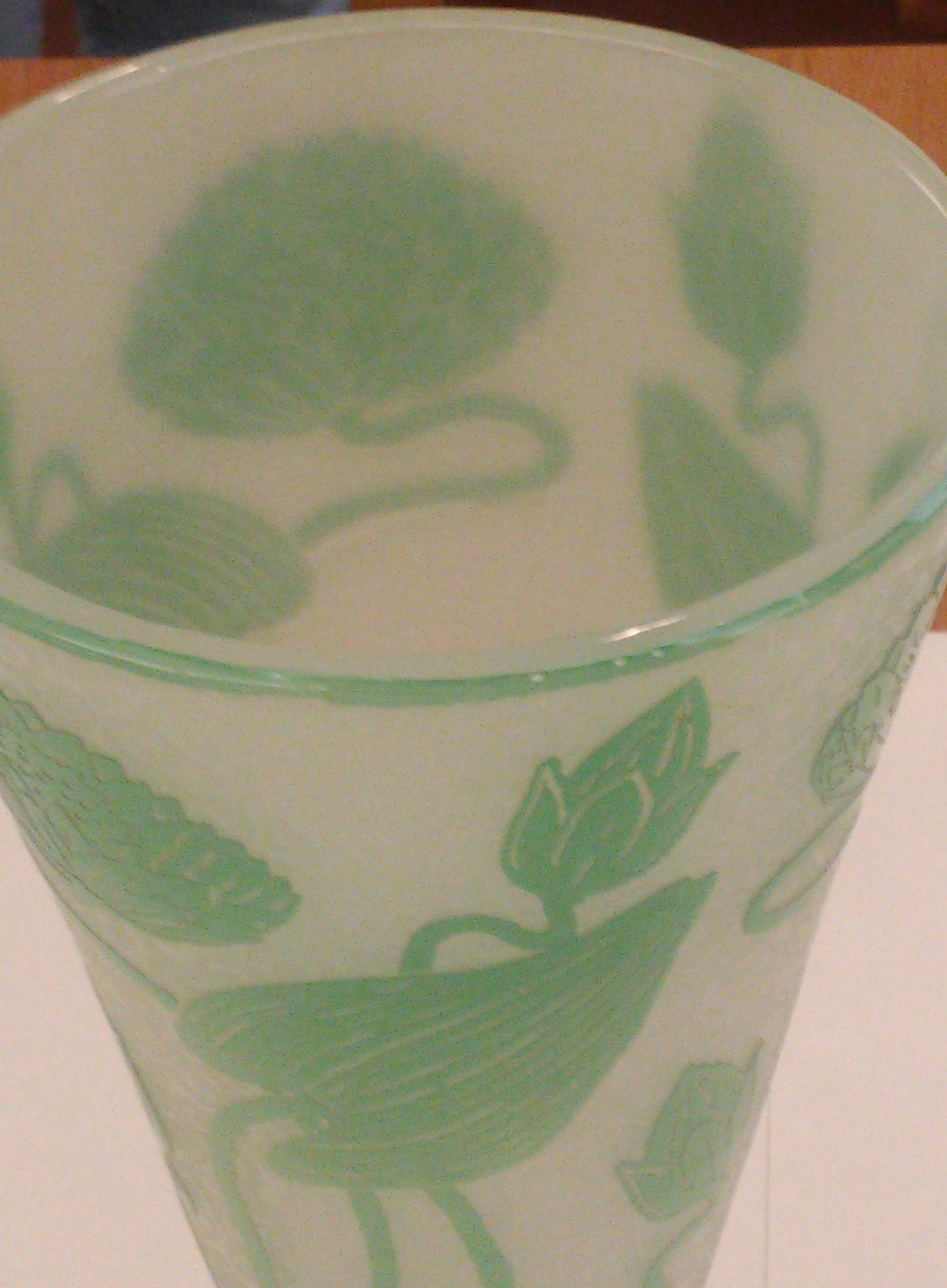
Like the left piece, this one was definitely intended for display rather than directly utilitarian or practical purposes. It looks too heavy to be good for drinking, and it’s deep enough to where I can see it holding flowers or something similar but not much else. Realistically, you could put whatever you wanted into it, but it seems to me that its most practical purpose would be as a flower vase– and even then, it’s being used for display purposes. Especially if the green of the plants were played with by the green of the glass, accented by yellow flowers. I agree with whoever paired these objects– a yellow or orange would fit this piece nicely.
Both pieces seem to use glass to emphasize the color of their objects rather than their transparency, ability for fine sculptural details, or ability to play with light. Both also contain their color variations rather than applying them only on a surface level.